The Leverage Shares homepage was redesigned to create a clearer, more premium, and structured user experience. The goal was to improve content hierarchy, simplify navigation, and transform the homepage from a collection of sections into a more intentional and guided journey for users.
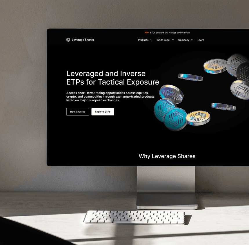
The original homepage felt cluttered and fragmented, with multiple sections competing for attention and no clear flow. Important information such as the value proposition and trust signals were not communicated effectively, which made it harder for users to understand the platform or know where to focus.
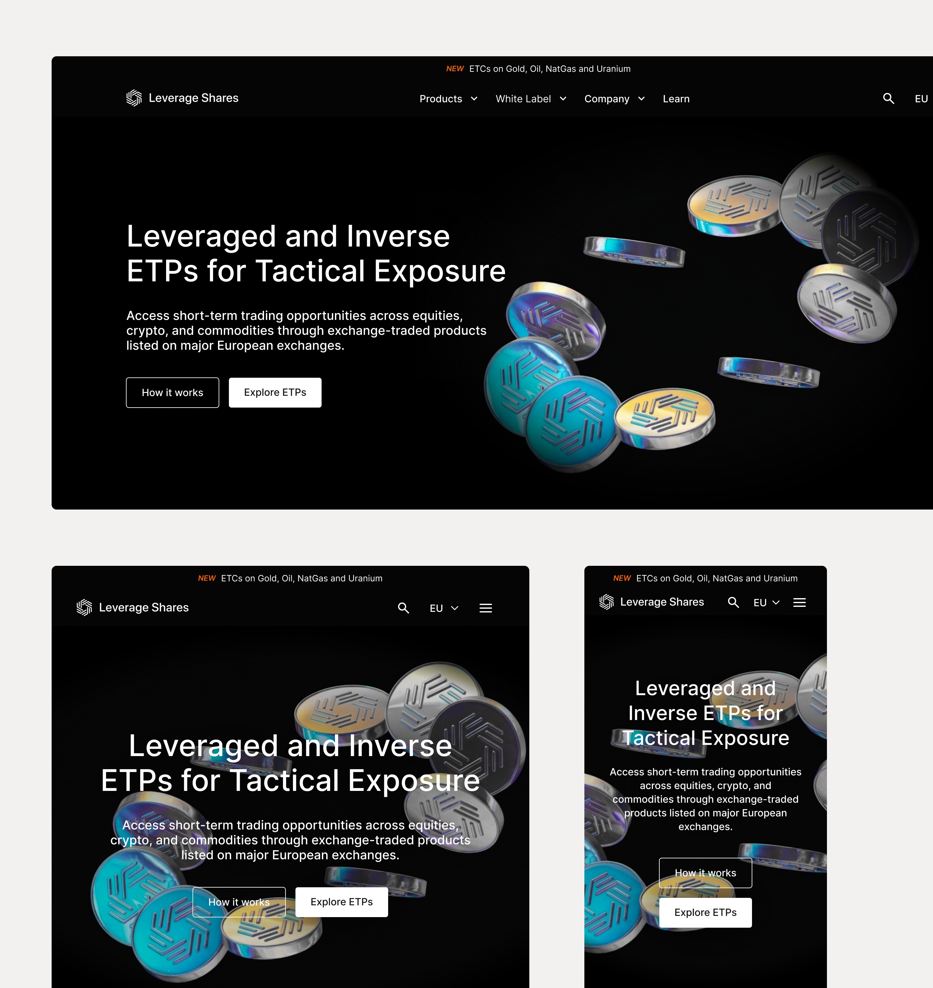
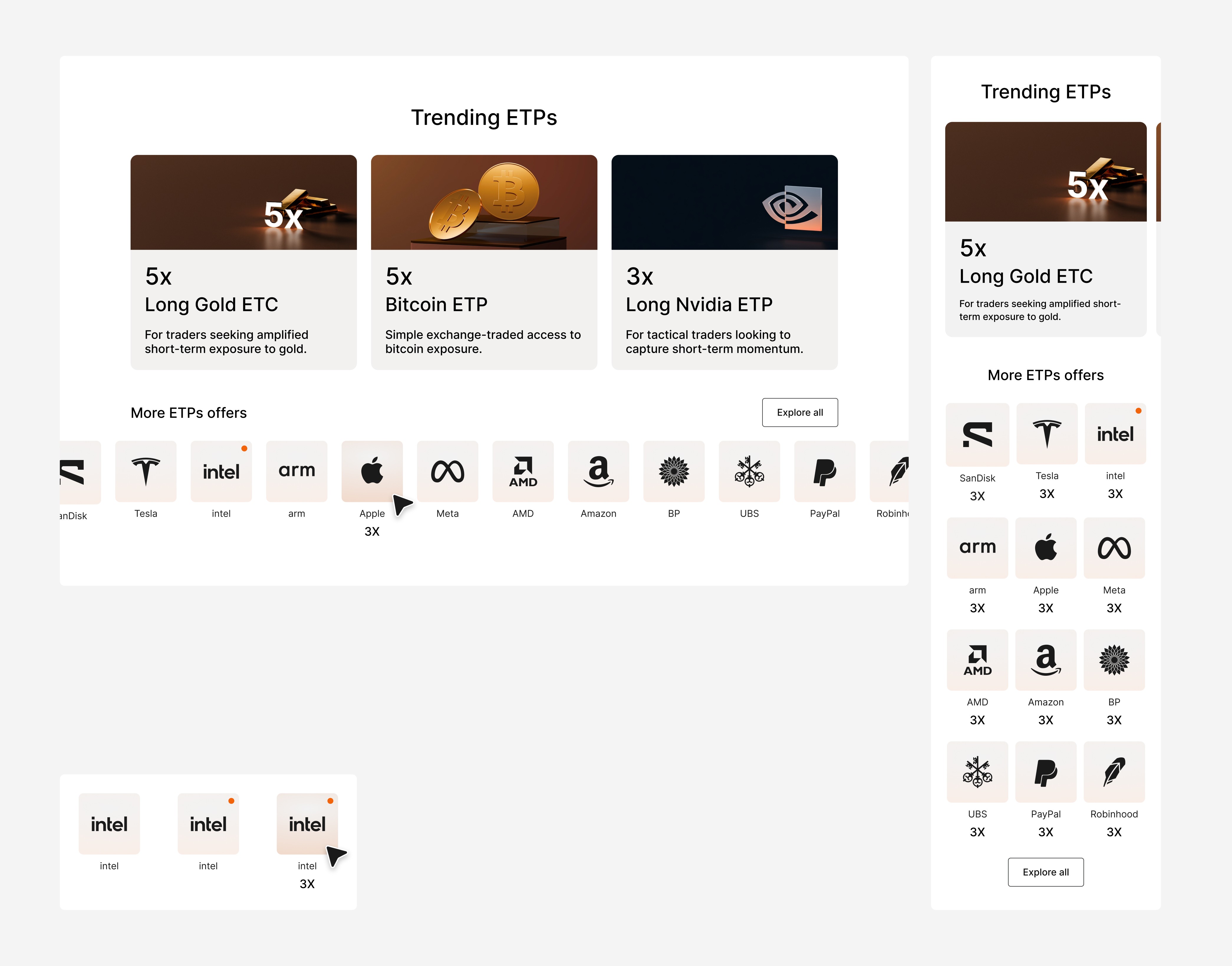


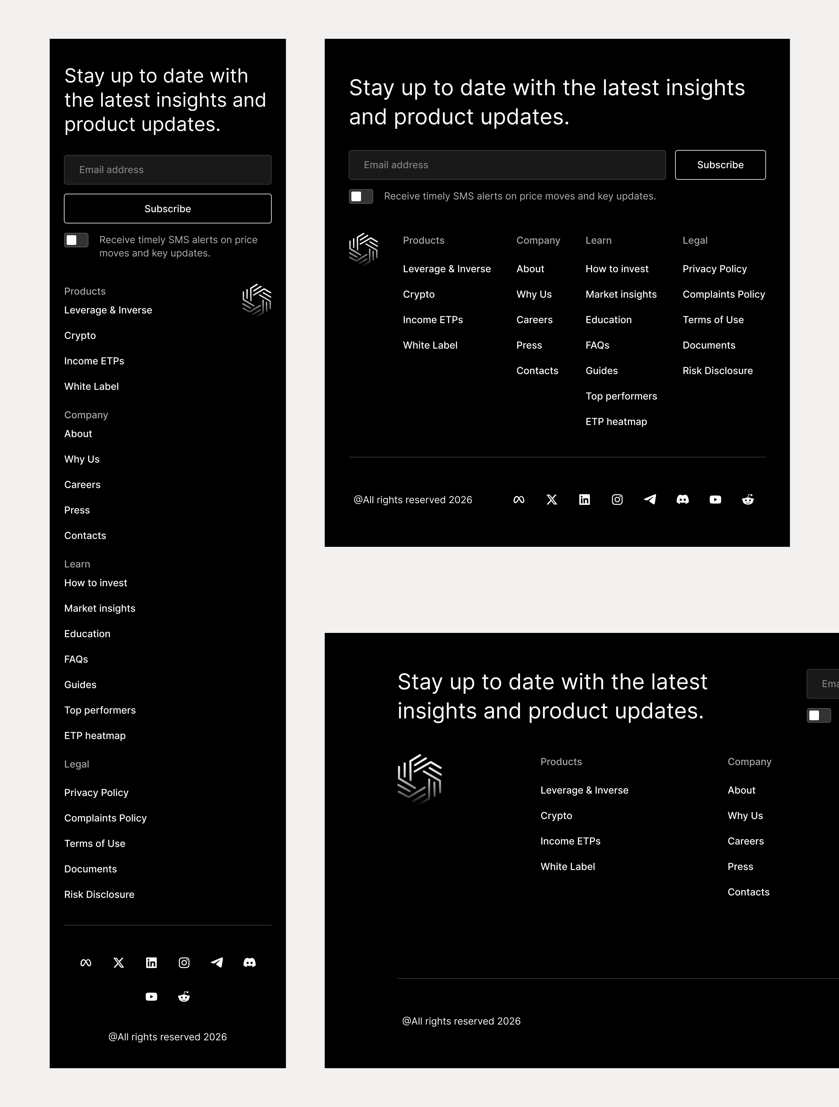
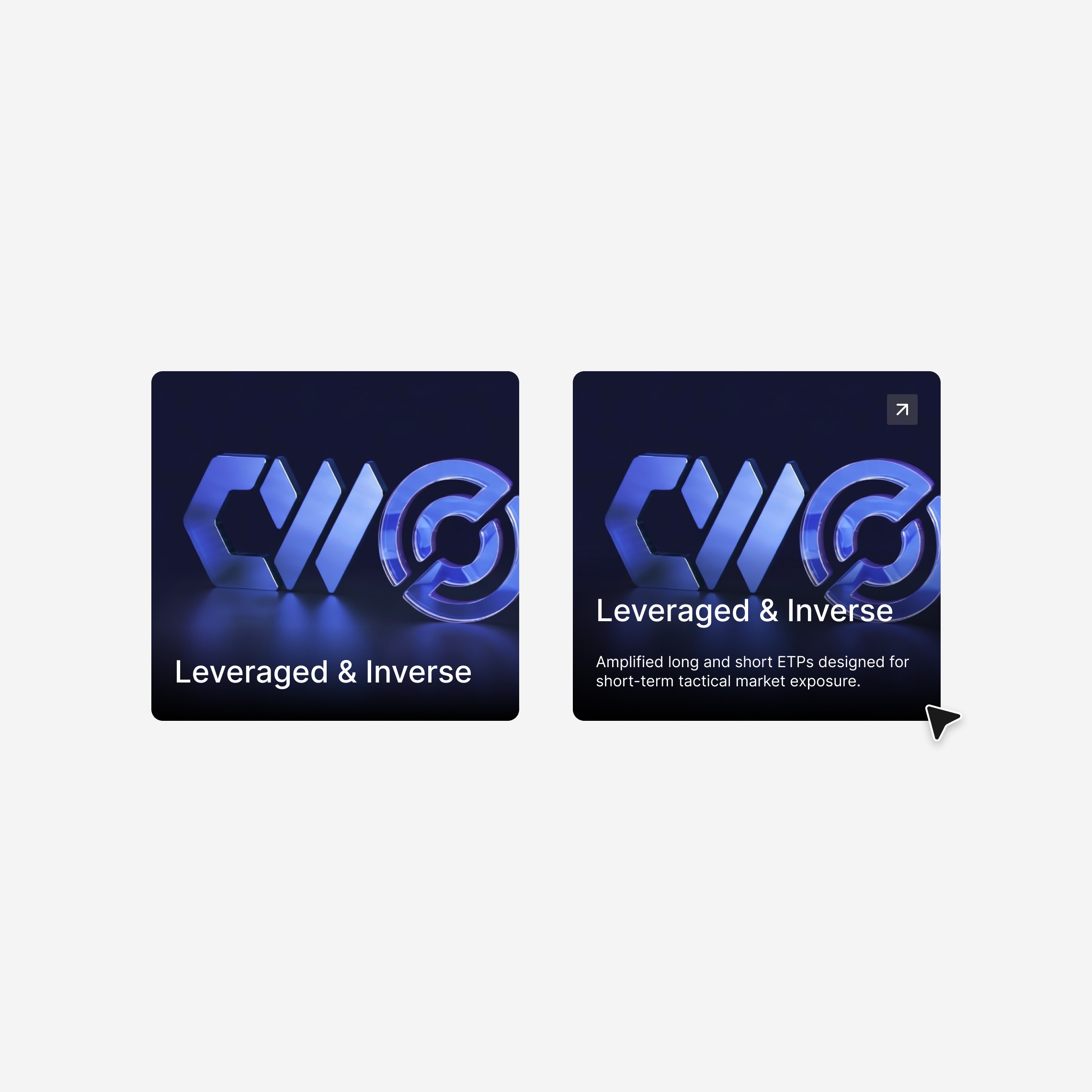
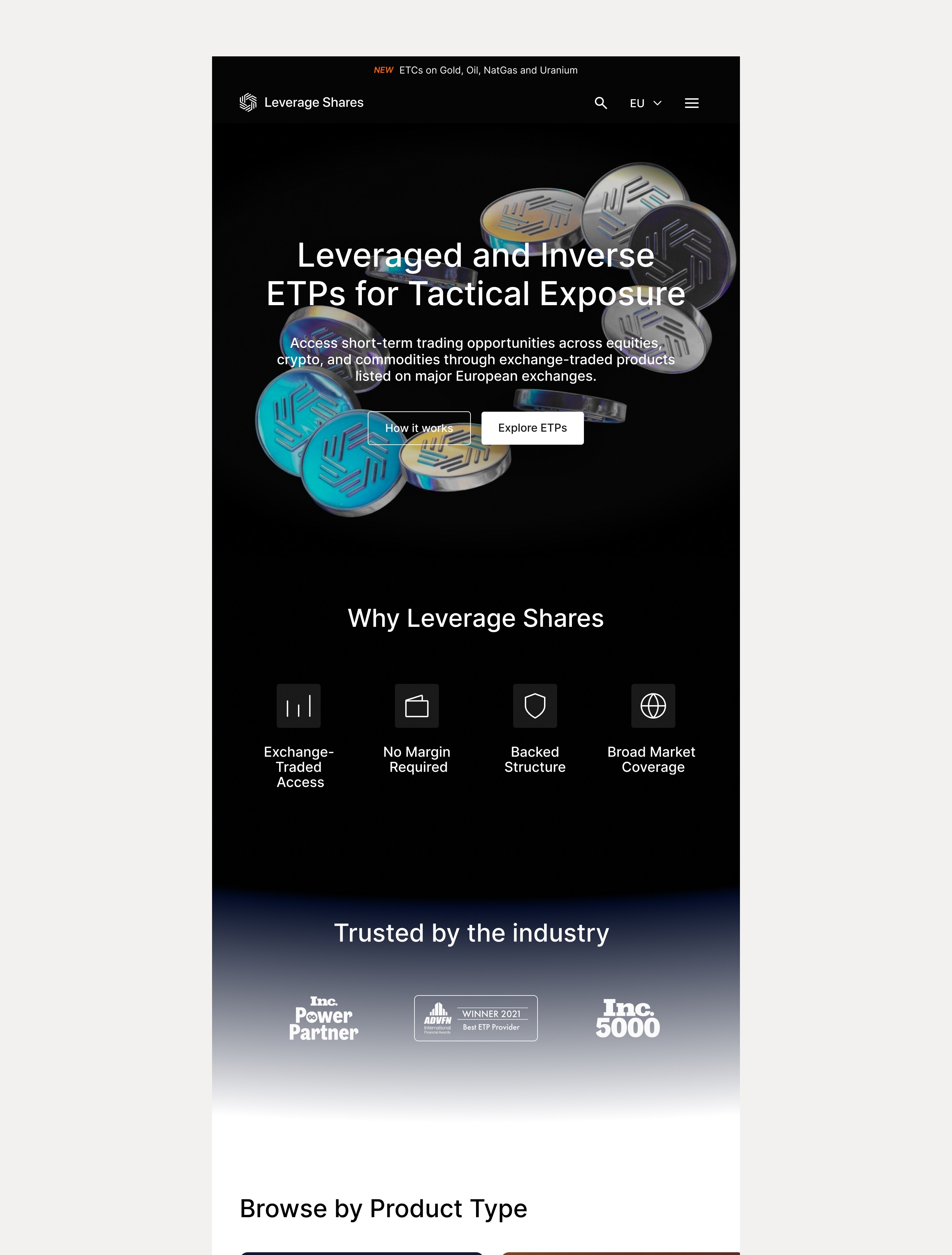

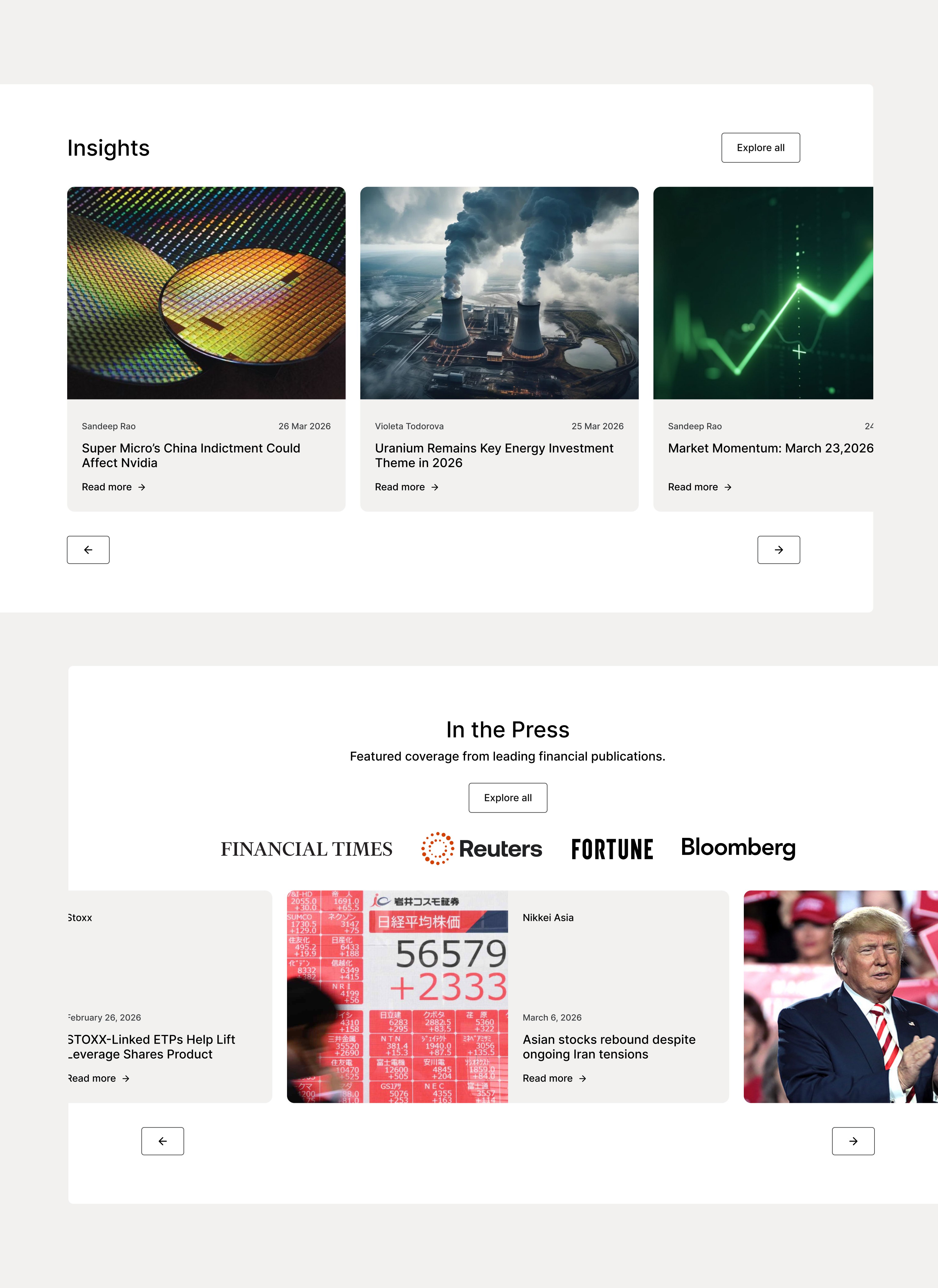
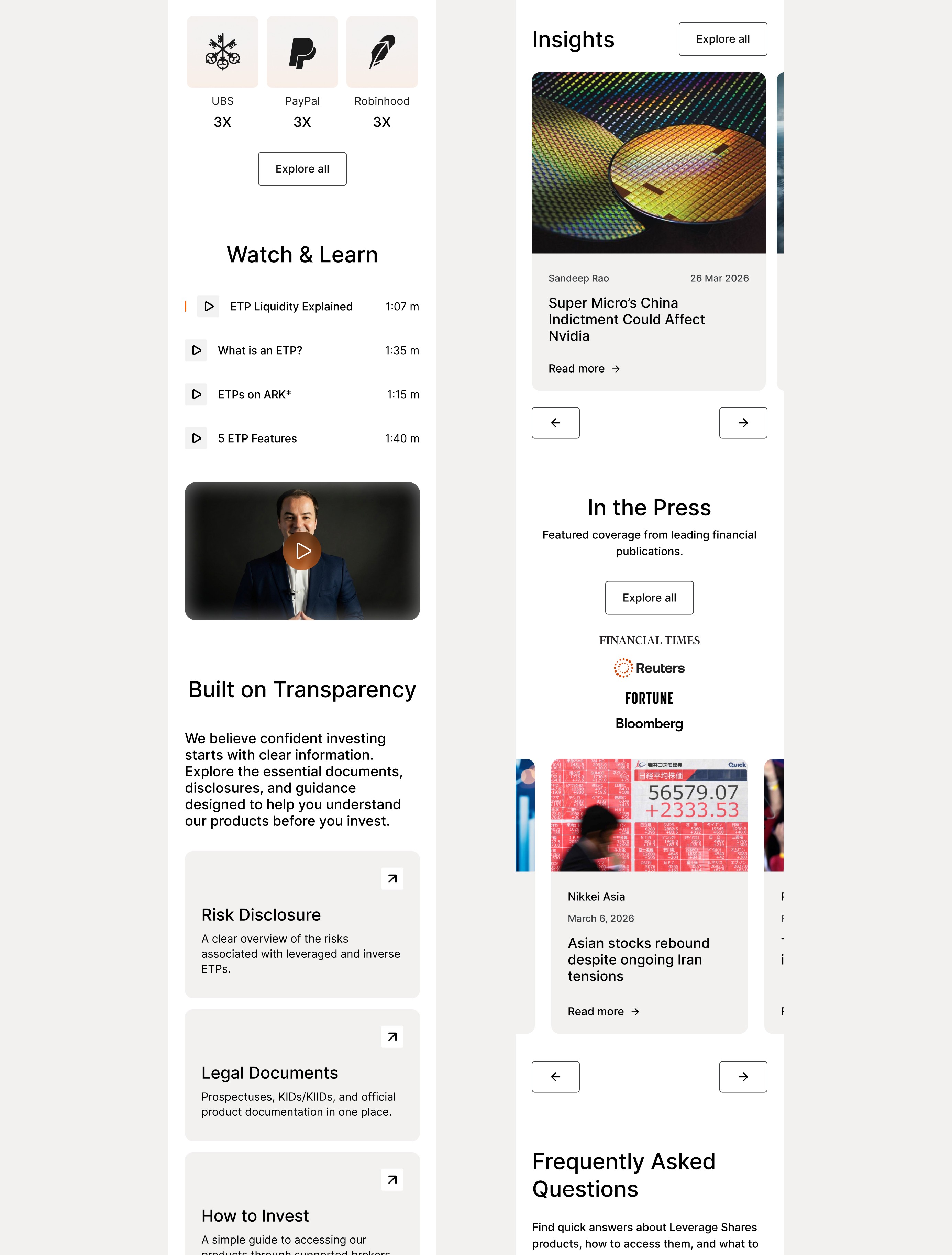
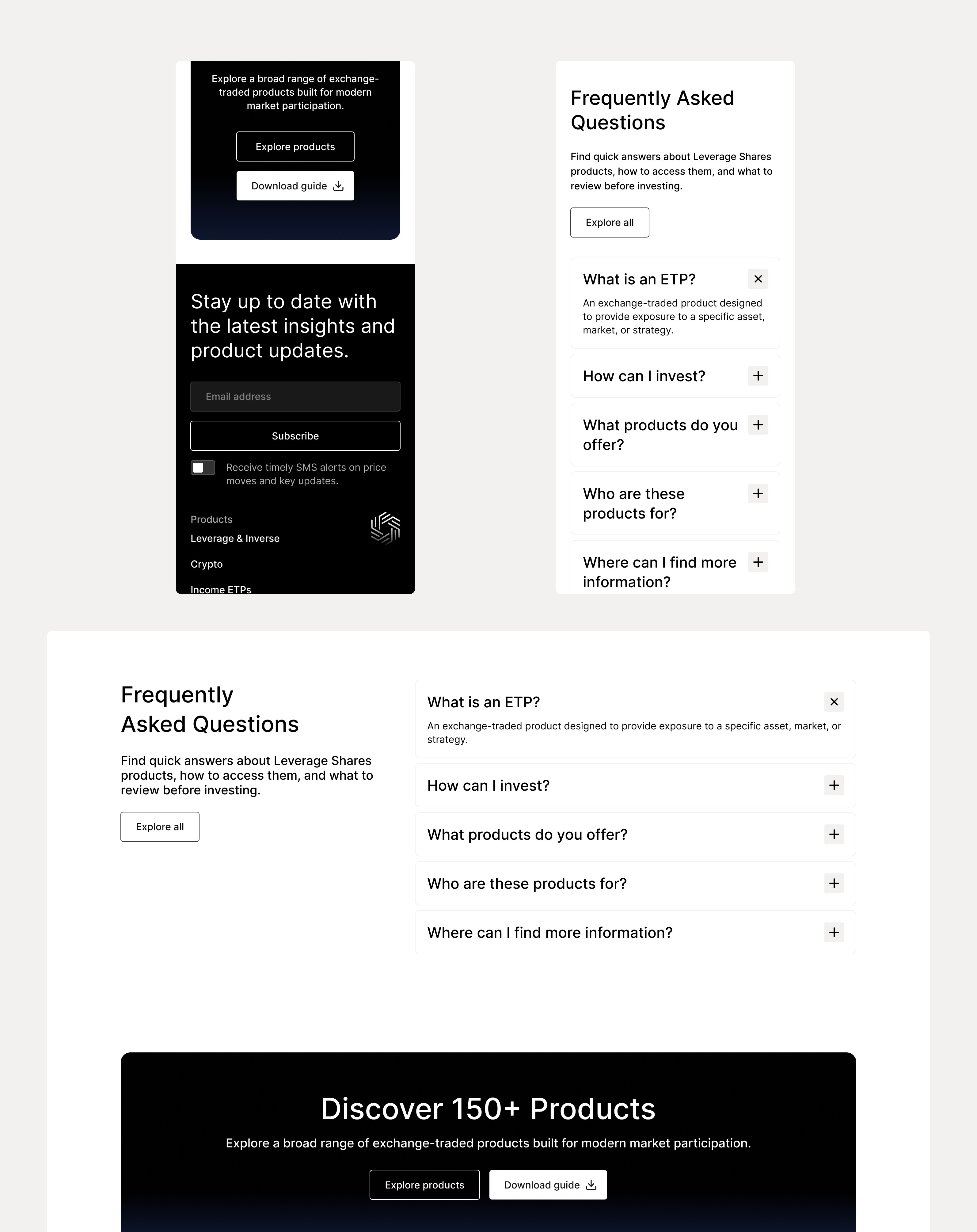
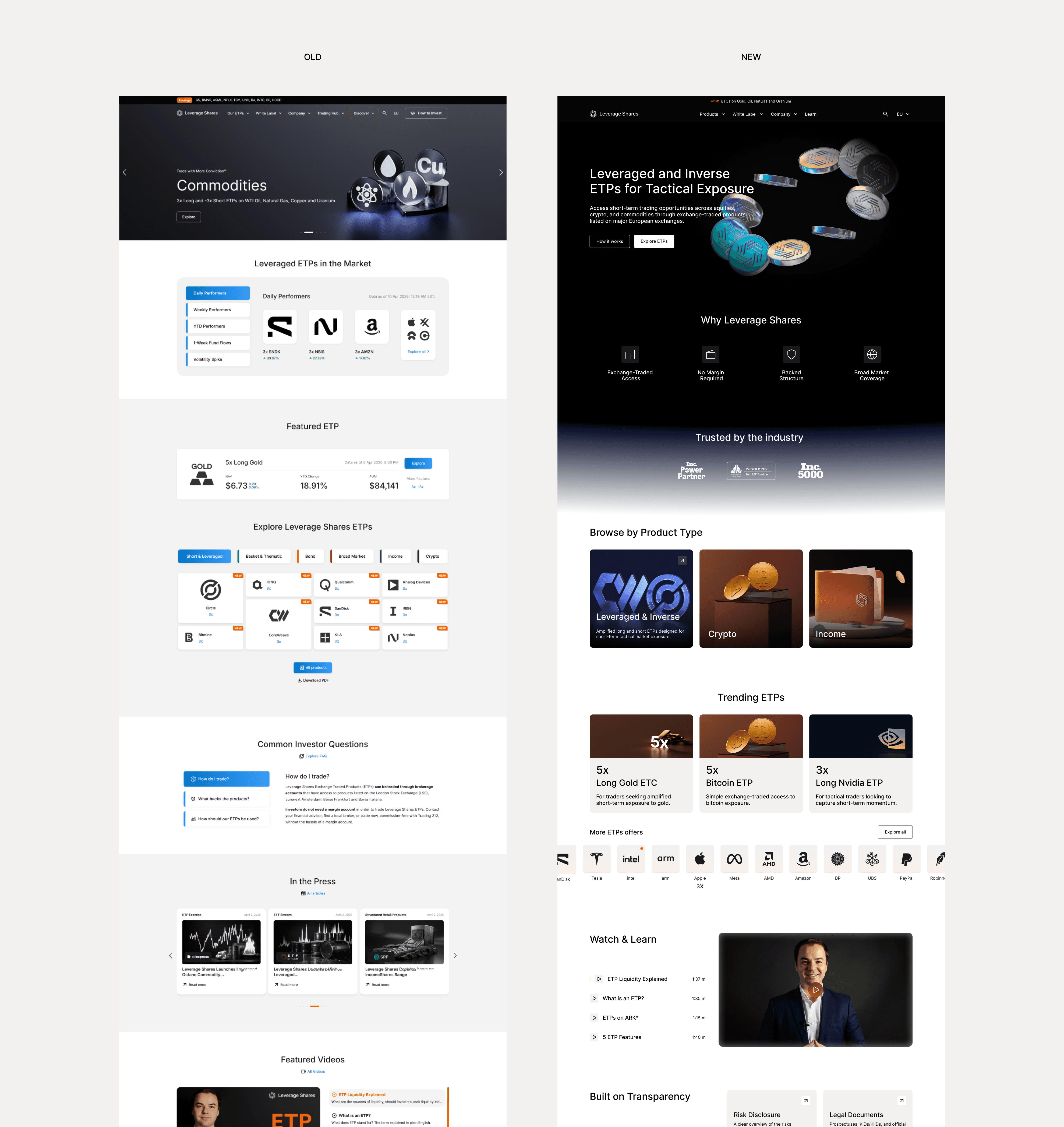
The redesign focused on creating a clearer, more structured flow that guides users from understanding the value to exploring products. The hero was simplified to highlight the core offering, product discovery was reorganized, and trust signals were introduced earlier. Visual hierarchy was also improved to reduce clutter and create a cleaner, more premium experience.
The final result is a homepage that feels clearer, more intuitive, and easier to navigate. Users can quickly understand the platform’s value, explore products more efficiently, and build trust earlier in their journey. Overall, the experience is more structured, more engaging, and better aligned with modern financial platform standards.